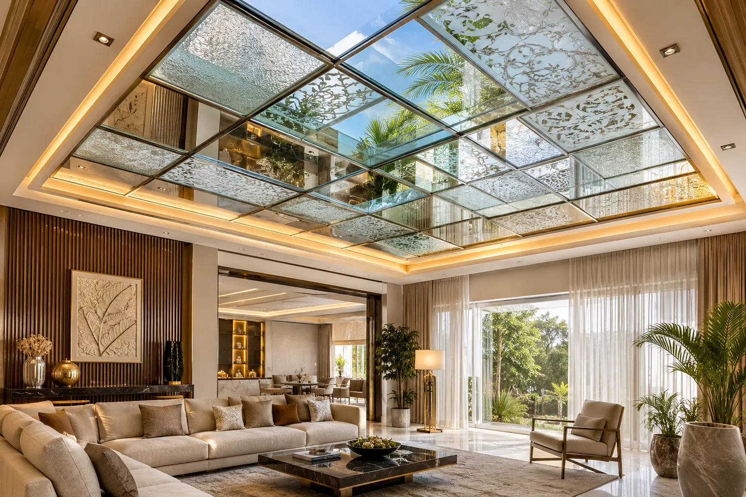
In interior design, colour theory is something much more than aesthetics. A thoughtfully selected colour palette can make a small room appear more spacious, calm, and less overstimulating, and create emotional resonance with inhabitants.
Many homeowners overlook the importance of the strategic framework and apply colours intuitively. That is where a good knowledge of colour theory becomes essential.
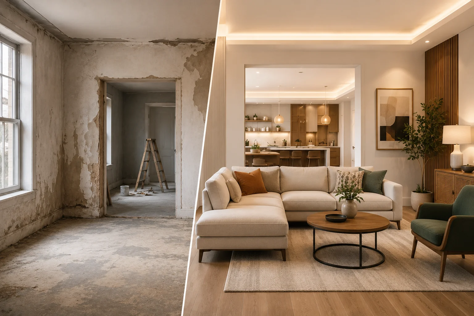
This guide breaks down the fundamental principles of colour theory and shows you how to apply them in real-world scenarios. This knowledge becomes useful when you're refreshing a single room or planning a complete home renovation.
Why Colour Matters So Much in Interior Design?
Colour is the quickest and most cost-effective tool available to designers for transforming a space. Colour can help do much more in interior design. Understanding what colours can do to your ambiance helps you make informed decisions that align with your lifestyle.
Here are a few things that colours can do to your interiors –
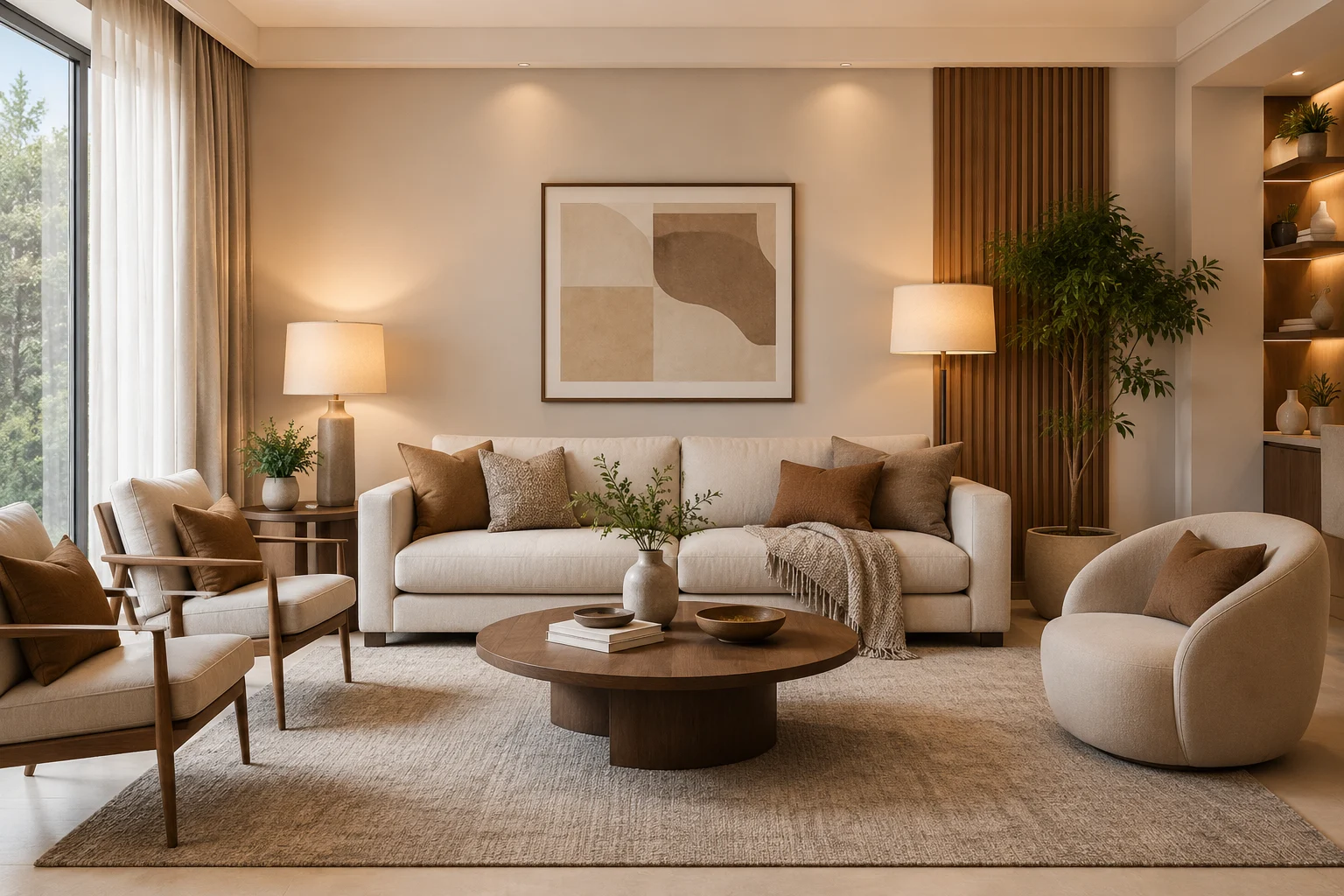
It sets the mood of a space. It helps you define feelings like calm, cozy, energetic, and luxurious.
It shapes how large or small a room feels.
It links different rooms into a cohesive story.
It highlights features you love and hides those you don’t.
The colour theory helps you create harmony in your room. It gives you the framework to achieve that harmony consistently.
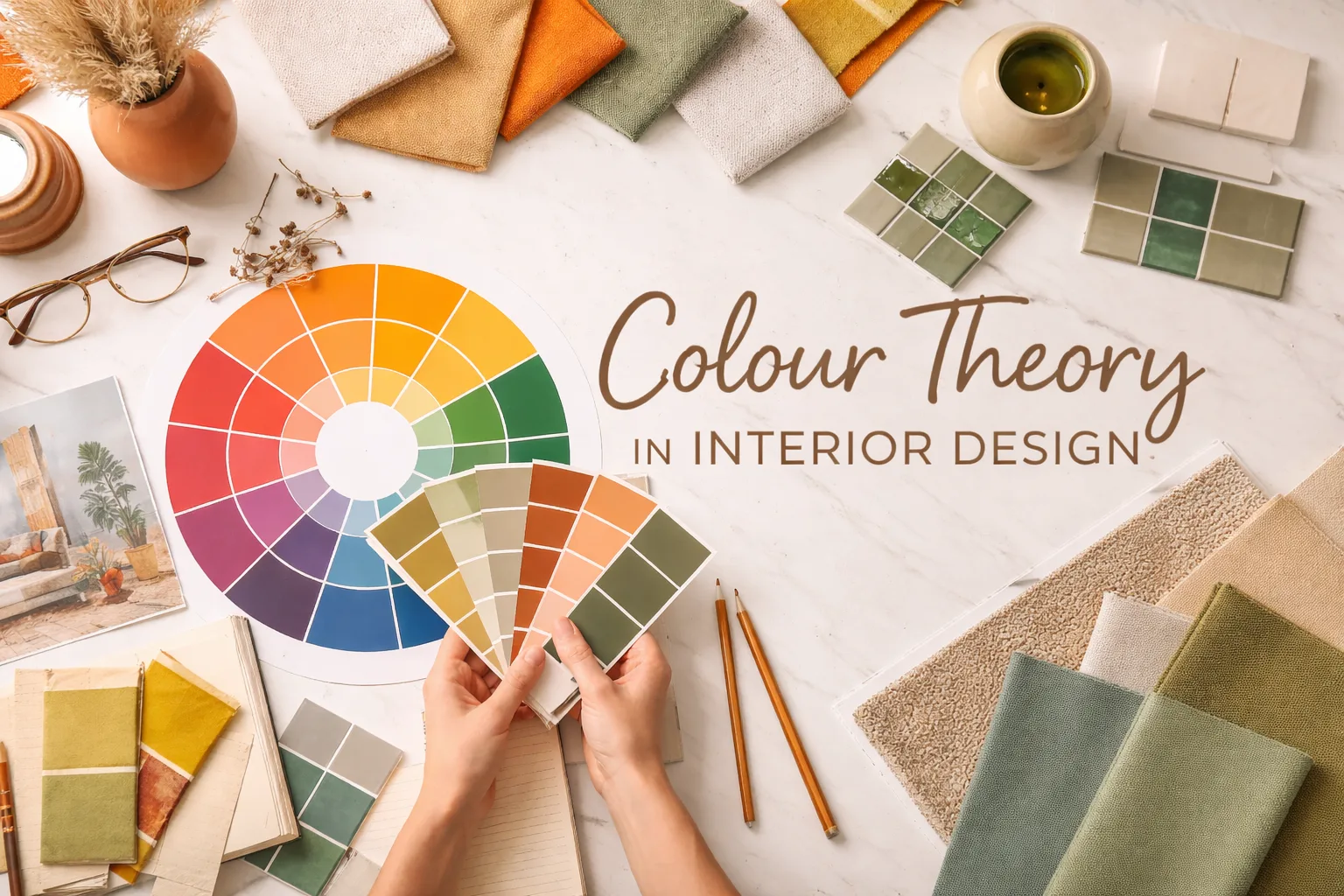
The Colour Wheel: Your Interior Design Roadmap
The prime aspect that is at the heart of the colour theory is the colour wheel. A colour wheel is a circular diagram that shows how colours relate to one another. Understanding the colour wheel can help you avoid guesswork and make your interiors stand out.
The primary parts of a colour wheel include
Primary, Secondary, and Tertiary Colours
Primary colours - Red, blue and yellow. These cannot be made by mixing other colours.
Secondary colours – These colours are formed by mixing any two of the primary colours. Red and yellow bring up orange. Likewise, Blue and yellow give you green. The third secondary colour is purple, which is formed by mixing red and blue.
Tertiary colours – These are formed by mixing a primary with a neighbouring secondary. These are the nuanced, in‑between shades designers love because they feel more sophisticated and unique.
For interiors, you’ll rarely use pure primaries on large surfaces. Instead, you’ll use softened versions (dusty blue, terracotta, sage, blush, etc.), which come from these basic relationships.
Warm vs Cool Colours
The colour temperature is another part of the colour wheel.
Warm colours
Reds, oranges, yellows, and some warm neutrals (camel, tan) belong to the category of warm colours. These colours feel energetic, social and inviting.
The warm colours work well in living rooms, dining areas, and entryways. These areas are where you entertain and interact.
Cool colours
Cool colours include blues, greens, purples and cooler greys. They feel calm, restful and refreshed.
Cool colours are found to be ideal for bedrooms, bathrooms, home offices and reading corners.
A well-designed home usually balances both: perhaps warm in social spaces and cooler in private, restful areas.
Neutral colors
Neutral colours include white, off-white, beige, greige, taupe, charcoal, and black. These colours provide a good base for the bold accents. They can be an excellent option for changing the look of a room by swapping accessories rather than repainting everything.
Colour Schemes That Work in Real Homes
A study of the colour wheel provides you with an excellent means to try out and experiment with the colour themes that are easier to adapt to.
Monochromatic
A monochromatic theme uses one base colour and alters it with the use of different tints, shades and tones.
This approach is ideal for small spaces or minimalist interiors. In fact, it feels calm, cohesive and elegant rather than busy.
Analogous
The analogous colour scheme uses the colours that sit adjacent on the colour wheel. Some of these combinations include blue–blue‑green–green, or yellow–yellow‑orange–orange.
The result is a soft, natural flow of colour with just enough variation to stay interesting.
Complementary
Complementary colours sit opposite each other on the wheel. These would include blue and orange, red and green, and yellow and purple.
They would need to be used quite thoughtfully. These colours bring the vibrant contrast and energy. These complementary colours help you keep the space dynamic without feeling overly chaotic.
Split-Complementary and Triadic
Split-complementary colours: One base colour plus the two colours next to its opposite on the wheel make up the split-complementary colours. This gives you contrast but feels softer than a direct complementary pair.
Triadic colours: This includes three colours evenly spaced on the wheel, such as red, yellow and blue. These are bold and playful, often seen in kids’ rooms, creative studios or eclectic spaces.
Colour Psychology: Designing for Mood and Function
The colour theme used in a room influences the feeling and psychology. Let us explore a few rooms and analyze which colours look good in them.
Living and Dining Spaces
For areas where people gather, you may want warmth and connection:
Soft terracotta, warm beige, muted mustard or rich earthy tones feel inviting.
Deep blues or greens can add sophistication, especially when paired with warm metallics like brass or gold.
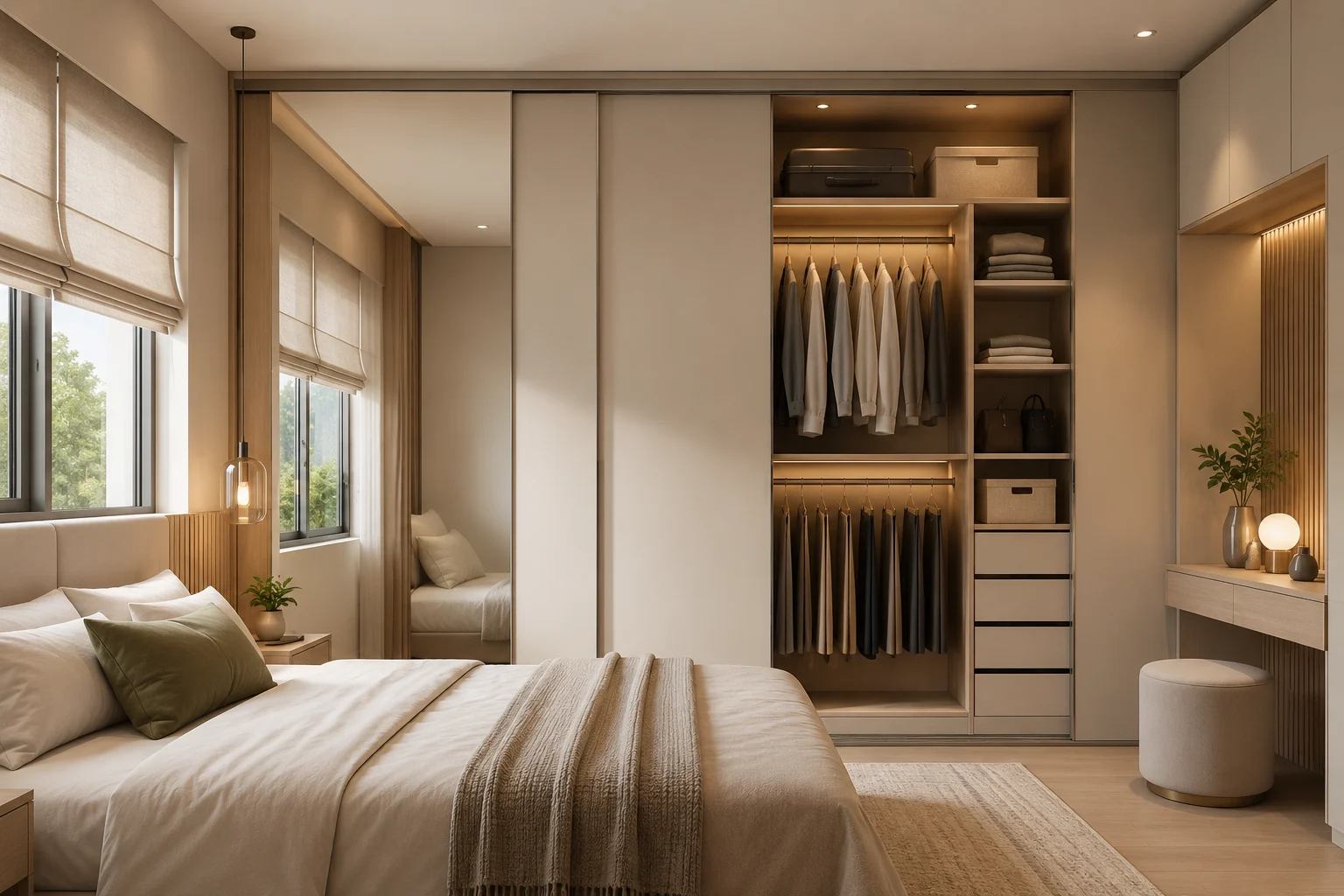
Bedrooms and Retreats
Bedrooms are usually designed as calm, restorative spaces:
Cool blues, blue‑greens and gentle mauves promote relaxation.
Soft neutrals wrap the room in a sense of quiet comfort.
Very intense colours (like strong red) are best kept to small accents here.
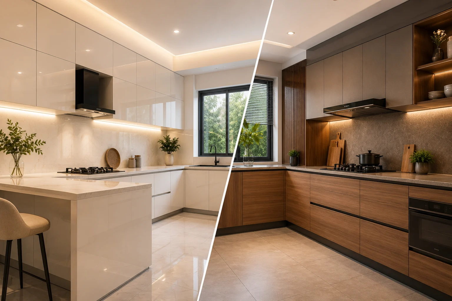
Kitchens and Workspaces
These spaces often need a balance of energy and clarity:
Fresh greens and light blues feel clean and uplifting.
Warm whites and light woods keep the environment bright and welcoming.
A pop of a stronger colour can create a striking focal point without overwhelming the space.
Creating Balanced Interiors with Lemon Interiors
The colour theory is the strategic architecture underlying every thoughtfully designed interior. The principles that we have explained here are the foundation on which professional interior designers work. Understanding these principles thoroughly can help create a home or office space that is genuine and reflects your personality.
If you think these concepts are too complex to understand and implement, professional interior designers are there to help you. At Lemon Interiors, we specialize in translating colour theory into personalized spaces that reflect your lifestyle, aesthetic values, and functional needs. The question is not whether to consider colour theory, but rather how to apply it most effectively in your unique space.
What are you waiting for? Plan your interior design with a perfect knowledge of colour theory and bring every room to life.