
Earthy and Terracotta Colour Palettes for Small Kerala Apartments
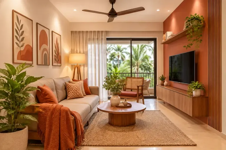
Earthy and terracotta tones have become some of the most practical colour choices for compact apartments across Kerala. These shades work well in smaller homes because they create warmth without closing a space in, and they sit naturally alongside the timber, stone, and woven materials common in Kerala interiors. This blog covers how to combine them, how to apply them across different rooms, and the mistakes worth avoiding before you commit to a palette.
Why Earthy and Terracotta Colours Suit Modern Kerala Apartments
Kerala homes have long embraced earthy colours and natural materials, from laterite walls and terracotta roof tiles to timber and stone. Experienced home interior designers in Cochin can bring these traditional elements into modern apartments, creating warm, inviting spaces that reflect Kerala’s heritage while maintaining a contemporary look.
Terracotta and earthy shades add warmth without relying on bright colours. In a compact apartment, they can make the space feel settled when balanced with lighter neutrals and natural light.
These colours also pair well with timber, cane, stone, and woven textures. This makes it easier to create a connected interior where colours and materials work together without making an apartment feel crowded.
Best Earthy and Terracotta Colour Combinations for Small Apartments
The most effective combinations pair terracotta with lighter neutrals that keep the space from feeling enclosed. This balance, with one warm anchor and quieter companions, is what makes the palette work in a smaller home.
- Terracotta and beige: Terracotta adds warmth and character, while beige keeps the room feeling light and balanced. Together, they work especially well in living rooms and bedrooms where you want a warm palette without making the space feel too heavy.
- Cream and terracotta: Cream avoids the sharp contrast that white tends to create next to terracotta. In low-ceiling apartments where the palette needs to stay warm throughout, this pairing holds the room together without feeling heavy.
- Warm neutrals: Sand, oatmeal, and warm taupe work naturally alongside terracotta without pulling attention away from it, particularly when the flooring is wood or stone.
- Brown and earth tones: Deep brown furniture or flooring pairs well with terracotta walls or soft furnishings. In bedrooms, this combination tends to feel settled and considered rather than put together by accident.
How to Use Terracotta Without Making Small Rooms Look Dark
Using terracotta as an accent rather than the main wall colour helps keep a small room feeling open. Covering every wall in a compact space can make the room feel visually heavier, especially when natural light is limited.
- In living rooms, a single terracotta feature wall behind the sofa creates warmth and visual focus. Paint the remaining walls in a lighter shade, warm white or off-white, to keep the space open.
- In bedrooms with limited natural light, terracotta works better as a soft furnishing colour than a wall colour. Terracotta bed linen, cushions, or curtains bring the warmth in without committing the walls to a shade that may feel heavy where daylight is limited. Test the colour in the actual room before making your final decision.
How to Combine Terracotta With Wood, Furniture and Decor
Terracotta and natural wood have warm undertones, which is why the two work so well together across flooring, furniture and accessories without any effort to make them feel coherent.
Light to mid-toned wood like teak or mango wood pairs well with terracotta. With darker wood flooring, keep the walls lighter and bring terracotta in through accessories and soft furnishings only.
- Furniture in cream, natural linen, or warm grey works better than cool grey, which tends to clash with terracotta’s undertone.
- Cane or rattan pieces bring in the earthy feel without adding visual heaviness, making them a good choice for compact apartments.
- Cushions and throws in rust, burnt orange, or ochre can add depth and variety without changing the wall colour.
Best Earthy Colour Palettes for Kerala Kitchens, Bedrooms and Living Rooms
Different rooms have different light conditions, usage patterns, and material requirements. The earthy palette needs to be adapted to each space rather than applied uniformly across the home.
- Small living rooms: Warm beige or greige on the walls, with terracotta coming through in cushions, a rug, and one feature wall, keeps the room feeling warm without making it feel smaller. A light ceiling and trim help maintain the sense of height.
- Modular kitchens: Kerala kitchens see frequent daily use, making durability and style equally important. Experienced kitchen interior designers in Kochi can incorporate terracotta accents through backsplash tiles, handles, or open shelving. Pairing warm wood shutters with cream or off-white walls creates a balanced, inviting look that suits modern Kerala homes.
- Compact bedrooms: Full intensity terracotta on bedroom walls can feel too stimulating before sleep. Clay, dusty rose, or warm taupe on the walls, with terracotta coming through in bed linen and curtains, gives the room warmth without that heaviness.
Choosing Paint Finishes and Materials for Kerala's Climate
Paint finish selection matters as much as colour in Kerala’s humid climate. The right finish affects both how the colour looks and how well it holds up over time.
- In living rooms and bedrooms, eggshell or satin finishes clean up more easily and hold their appearance better than flat matte in rooms where ventilation changes through the day.
- In kitchens and bathrooms, the product you choose matters more than the sheen. Pick something rated for moisture resistance and regular cleaning, and follow the application guidance on the tin.
- A matte finish makes terracotta appear deeper and more rustic. A satin finish gives the same shade a slightly lighter quality. Test a sample in your actual room before committing.
Common Colour Selection Mistakes in Small Apartments
These mistakes come up regularly in compact apartments and are worth checking before you finalise a palette. Most of them are easy to avoid once you know what to look for.
- Too many dark or warm shades together: Terracotta walls, deep brown furniture, and dark flooring in one room will drain the light quickly. Keep at least one surface genuinely light.
- Ignoring existing undertones: Terracotta carries a warm red-orange undertone. Cool grey floor tiles or furniture will clash with it. Test wall colours against your fixed surfaces first.
- Not checking natural light: A shade that looks warm in a showroom can feel heavy in a north-facing room. Look at paint samples in your actual space at different times of day.
- Matching everything too closely: An interior where every element sits in the same earthy range tends to feel flat. One lighter neutral and one textural contrast make the palette read better.
Read more about Sliding vs Hinged Wardrobes: Which Is Better for Small Kerala Bedrooms?
How We Choose Colours for Kerala Homes
At Lemon Interiors, colour selection is always considered alongside material, lighting, and spatial decisions in a project. A shade that works in one apartment may not work in another with a different orientation or ceiling height, and we approach every space with that in mind.
For homeowners across Kerala planning a new interior or refreshing an existing one, our design team works through the palette as part of the full interior brief. Contact Us for a free consultation and get a clear starting point for your space.