Top Colours For Office Interior Designs
The role of colour in office interior design extends far beyond mere aesthetics. It wields the power to influence mood, productivity, and the overall atmosphere of a workspace. The right colour palette can create an environment that energizes and motivates, while the wrong one might lead to distraction or discomfort. Colours have the unique ability to evoke emotions and affect the psychological well-being of employees, making their choices critical in office design. This blog delves into the world of colours, exploring how different hues can transform office spaces. From boosting employee morale to reflecting on a company’s brand, we’ll uncover the impact and importance of making informed colour choices in creating conducive, vibrant, and effective office environments.
The Psychology of Color in the Workplace
Colour psychology has a major impact on the mood or tone that is created within the office setting. Colour affects the level of mood and behavior of the people, directing them towards increased production and general employee feeling. For instance, blue is renowned for its calming effect, promoting concentration and mental clarity, making it ideal for intensive workspaces. Green, symbolizing nature and tranquility, can reduce eye strain and foster a sense of balance, perfect for areas where employees need to rejuvenate.
Conversely, colours like red can evoke feelings of energy and urgency, suitable for dynamic environments but potentially overwhelming if overused. Yellow, often associated with creativity and optimism, can be an excellent choice for collaborative spaces, stimulating open communication and innovative thinking.
In office design, understanding colour psychology allows for the strategic use of hues to create the desired ambiance. A mix of calming blues or greens in focus areas, combined with energizing accents of red or yellow in collaborative spaces, can optimize the work environment for both productivity and creativity. This thoughtful application of colour psychology is crucial in crafting an office space that not only looks appealing but also supports and enhances the day-to-day experiences of its users.
Choosing the Right Color Palette Office Interior Designs

Choosing the Right Color Palette Office Interior Designs
Selecting the right colour palette for an office requires a thoughtful balance between aesthetics and the company’s identity. A cohesive colour scheme not only enhances the visual appeal but also reinforces brand consistency throughout the workspace. Start by considering the company’s brand colours as a primary guide.These colours for office interior designs can be used as focal points or accents to create a sense of identity and continuity.
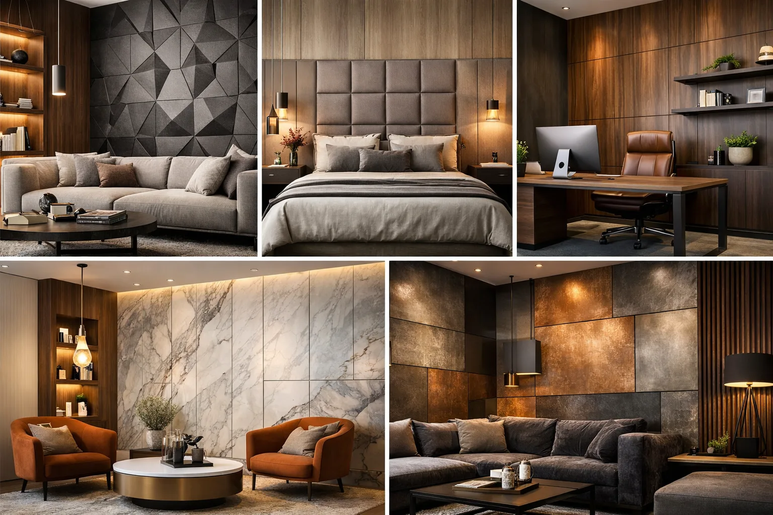
It’s also essential to understand the company’s culture and the atmosphere you want to cultivate. For a more formal and professional environment, neutral tones like grays, whites, and beiges offer a sophisticated backdrop. These can be complemented with brand colours for a subtle yet effective branding strategy.
In spaces that encourage creativity and collaboration, incorporating bold colours for office interior designs can invigorate and inspire. However, to avoid sensory overload, balance these with neutral tones. For example, a vibrant accent wall in a brainstorming room can be offset by muted furnishings or decor. This approach ensures that the bold colours energize without overwhelming, maintaining a harmonious and productive work environment.
Popular Color Choices for Modern Offices
Contemporary office design has embraced a diverse palette of colours, moving beyond the traditional whites and grays to incorporate more vibrant and dynamic hues. Trending colour schemes often include calming blues and greens, which promote a sense of tranquility and focus. These colours are frequently used in areas designated for concentration and individual work.
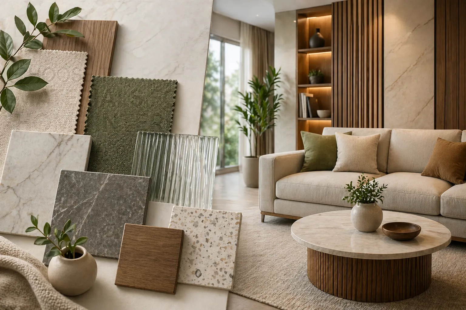
Another popular trend is the use of warm, earthy tones like terracotta, olive green, or muted ochre, which create a welcoming and comfortable atmosphere, ideal for lounge areas and informal meeting spaces. These colours can be paired with natural materials like wood and stone for a cohesive, organic feel.
For more creative and energetic environments, bolder colours like teal, burnt orange, or even soft pinks are becoming increasingly popular. These can be effectively used in collaborative spaces to stimulate creativity and interaction.
Effective colour combinations might include a base of neutral tones with splashes of these bolder colours as accents. For instance, a predominantly gray workspace can be enlivened with teal or yellow accents in furniture or artwork. Such strategic use of colour not only enhances the aesthetic appeal of the office but also helps in demarcating different zones and creating varied themes within the same workspace.
Colour Considerations for Different Office Spaces

Colour Considerations for Different Office Spaces
When tailoring colour choices for different office areas, it’s crucial to consider the function of each space. In open workspaces, where focus and collaboration are key, a blend of blues and greens can promote productivity and calm. These colours for office interior designs can make large spaces feel more cohesive and less overwhelming. For private offices, which are often spaces of concentration and decision-making, deeper shades like navy or forest green can add a sense of serenity and sophistication.
Meeting rooms, where communication and energy are important, can benefit from warmer tones like muted oranges or soft yellows, fostering a welcoming and thought-provoking atmosphere. In contrast, recreational areas meant for relaxation and informal gatherings can embrace more vibrant hues, like bright greens or blues, to create a lively and rejuvenating environment.
In spaces with limited natural light, lighter shades can help make the area feel more spacious and brighter. Soft whites or light grays, accented with pops of colour through decor or furniture, can invigorate these spaces without feeling claustrophobic. These strategic colour choices can significantly influence the perception of space, making them feel larger, cozier, or more suited to their specific purpose.
More Ideas – Top Tips for Choosing a Color Palette for Home
Conclusion
The choice of colour in office interior design is a powerful tool that goes beyond aesthetics, significantly impacting mood, productivity, and overall workplace atmosphere. Selecting the right colour palette requires a thoughtful consideration of the office’s function, culture, and brand identity. From creating a cohesive and dynamic workspace to influencing the perception of space and light, colours play a pivotal role. As you embark on designing or revamping your office space, consider the profound impact of colour. For tailored advice that aligns with your specific needs and vision, consulting with design professionals can provide invaluable insights, ensuring your workspace is not only visually appealing but also conducive to productivity and employee well-being.
More Ideas – Interior Designing Tips That No Designer Will Share With You


